
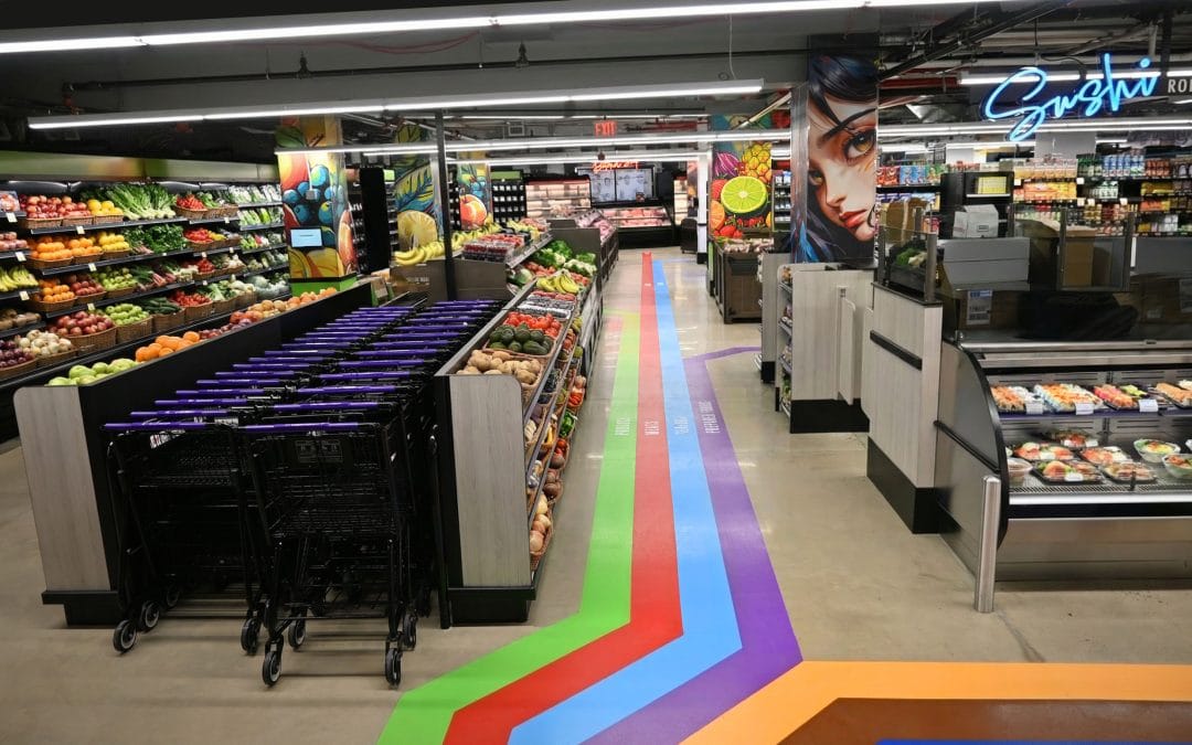
Grocery store design mistakes can cost retailers more than aesthetics. Poor layouts can hide profitable departments, create cart congestion, make products harder to find and turn a quick shopping trip into a frustrating one. The best grocery store design balances customer flow, merchandise visibility, department identity, operational efficiency and brand experience—all while making thousands of products feel surprisingly easy to shop.
That is much harder than it sounds.
Unlike many retail environments, a supermarket has to serve several purposes at once. A customer buying groceries for the week may be shopping alongside someone grabbing tonight’s dinner, another person picking up three forgotten ingredients and someone browsing prepared foods for lunch.
Meanwhile, employees are stocking shelves, filling displays, serving counters and moving products through many of those same spaces.
Good supermarket design has to account for all of it.
At Broden Design Group, decades of work in grocery and retail environments have shown us that successful stores aren’t simply the ones with the newest finishes or biggest signs. They’re the stores where design quietly makes shopping easier while helping important departments and products get noticed.
Here are 12 grocery store design mistakes that can undermine that experience—and what operators should consider instead.
1. Starting With How the Store Looks Instead of How People Shop
One of the biggest grocery store design mistakes happens before materials, colors or signage are even selected: beginning with an aesthetic concept instead of the shopper.
A supermarket isn’t experienced as a single room. It’s experienced as a sequence of decisions.
A shopper enters. Where do they look first?
- They move toward produce. Can they see where they’re going?
- They need the deli. Is it obvious where it is?
- They stop at a promotional display. Can another cart get around them?
- They remember they need milk. Does getting there require backtracking across the store?
This is why grocery store layout design has to start with behavior.
Before deciding what an area should look like, operators and designers should understand how customers enter, circulate, stop, browse, queue and leave. The design should then support those behaviors. A beautiful store that makes customers work harder isn’t good retail design. It’s decoration.
2. Hiding the Departments That Give Customers a Reason to Choose You
Not every square foot of a supermarket has equal strategic value.
Center-store staples may generate enormous sales volume, but departments such as produce, bakery, meat, seafood, deli, sushi and prepared foods can have an outsized influence on how customers perceive the entire store.
Those departments can communicate freshness, quality, expertise and convenience.
So why hide them?
One of the most consequential supermarket design mistakes is allowing tall fixtures, poorly placed displays or weak sightlines to obscure departments that should be selling themselves from across the store.
Broden Design Group’s work at ShopRite of Fair Lawn provides a useful example. Sushi was prominently positioned at the front of the department lineup, giving it greater visibility within the shopping experience. The project subsequently reported a significant boost in sushi sales.
That’s an important lesson for grocery retailers:
Visibility isn’t simply a design consideration. It can be a merchandising tool.
A customer cannot be tempted by a department they never notice.
3. Assuming More Merchandise Always Means More Sales
Grocery retailers understandably want to maximize selling space. But maximizing selling space and maximizing the effectiveness of the space are not necessarily the same thing.
- Add another promotional rack.
- Increase fixture height.
- Place a seasonal display at the end of an already busy aisle.
- Put another pallet near the entrance.
Individually, each decision may seem commercially sensible. Collectively, they can make the store harder to navigate.
Over-merchandising can block department sightlines, narrow circulation paths and make an otherwise large supermarket feel cramped. It can also reduce the impact of the merchandise itself.
When shoppers encounter too many competing products, displays and signs, visual priority disappears. Instead of seeing more, they may notice less.
The better question isn’t: “Can we fit another display here?”
It’s: “Will another display here improve or interfere with the shopping experience?”
Sometimes the most valuable square footage is intentionally left open.
4. Treating Every Grocery Department the Same
A supermarket should feel cohesive. It shouldn’t feel monotonous.
Produce, bakery, meat, seafood, prepared foods and center store each play different roles in the customer journey. Giving every department the same visual treatment can flatten those differences.
- Produce should make freshness immediately apparent.
- Bakery may benefit from warmth and cues of craftsmanship.
- Prepared foods should communicate convenience while still making the food feel appetizing.
- Meat and seafood departments often need to convey quality, cleanliness, expertise and trust.
The solution isn’t to turn every department into a completely separate brand. It’s to create differentiation within a consistent visual system.
Broden used this approach at ShopRite of Brookdale in Northern New Jersey. Individual departments received distinct design treatments while an industrial theme helped connect the overall store. The project also incorporated the Fresh to Table store-within-a-store concept, creating a more recognizable destination for ready-made meals.
That balance matters.
Customers should be able to tell when they’ve entered a different department without wondering whether they’ve entered a different store.
5. Wasting the First 30 Seconds of the Shopping Experience
The first few moments inside a grocery store are unusually important.
Customers are transitioning from the parking lot or sidewalk into a visually dense environment. They’re grabbing a cart, adjusting to the space and deciding where to go first.
Yet grocery entrances are often treated as premium real estate that needs to be filled.
Promotional bins. Seasonal products. Vendor displays. Posters. Digital screens. Loyalty messaging. Weekly specials.
The result can be an entrance that communicates everything except where to go.
A better grocery store entrance creates orientation before information overload.
Shoppers should quickly understand the character of the store, identify major destinations and see something that draws them farther into the space.
Often, that “something” should be one of the store’s strongest fresh or specialty departments rather than another promotional sign.
The entrance doesn’t need to sell every product.
It needs to sell the experience of continuing into the store.
6. Using Signage to Fix a Layout Problem
Here’s a useful grocery design rule: If you need increasingly more signs to explain where customers should go, the problem may not be the signs. It may be the space.
Good grocery store wayfinding combines architecture, department placement, sightlines, lighting, visual hierarchy and signage. Signs should confirm where customers are going rather than compensate for a confusing environment.
This becomes especially important in stores that have been expanded or remodeled several times. A department moves. Another gets added. Prepared foods expands. Pickup gets incorporated. A new service is introduced. Eventually, the customer journey may no longer feel intuitive. Adding another hanging sign can help, but it doesn’t necessarily solve the underlying issue. Before adding signage, ask whether the destination itself is visible and whether the path toward it makes sense.
7. Making Every Sign Compete for Attention
Even well-planned grocery stores can become visually exhausting when signage accumulates.
A typical shopper might encounter department identifiers, aisle markers, price signs, temporary promotions, digital screens, manufacturer displays, loyalty offers, nutrition messaging and seasonal graphics during a single trip. If they all demand equal attention, none of them receive it.
Effective supermarket signage needs hierarchy. A shopper moving through the store should be able to distinguish between information that helps them navigate and information intended to influence a purchase. That means permanent wayfinding should generally have greater visual consistency, while promotional communication should be controlled enough that important offers still stand out.
Digital signage deserves the same discipline. A screen isn’t automatically more effective because it moves. If customers don’t need the information at that particular point in their journey, it may simply become another source of visual noise. Every sign should have a job. If the team can’t identify that job, the sign may not need to exist.
8. Designing Only for the Traditional Weekly Grocery Trip
The weekly stock-up trip still matters. It just isn’t the only way people use supermarkets.
A shopper might be looking for:
- A full week’s groceries
- Tonight’s dinner
- A ready-to-eat lunch
- A few items on the way home
- Prepared food for a gathering
- A quick pickup order
- One forgotten ingredient
Those shopping missions have very different definitions of convenience.
A customer buying 40 items may be comfortable moving through the entire store. Someone buying dinner and a drink may not want the same journey. Modern grocery store design should make room for both.
Prepared foods, grab-and-go, checkout, fresh departments and other convenience-oriented areas should be evaluated in relation to how customers actually use them.
Sometimes that means creating clearer shortcuts. Sometimes it means changing department adjacency. Sometimes it’s simply making a destination more visible from the entrance.
Convenience isn’t always about making a store smaller. It’s about making the customer’s desired trip feel shorter.
9. Creating Bottlenecks Around the Most Successful Departments
Ironically, the best-performing part of a grocery store can create one of its worst design problems.
Consider a popular deli department.
One shopper is ordering. Another is waiting. Two people are looking at prepared foods. Someone has parked a cart while checking an order number. An employee is restocking a nearby case.
Then regular traffic tries to pass through.
That’s how congestion develops even when an aisle technically meets its required dimensions.
Grocery store traffic flow should therefore be designed around behavior, not just measurements.
Ask:
- Where will customers naturally stop?
- Where will queues develop?
- Where will carts accumulate?
- Which displays encourage longer browsing?
- Where do employee stocking routes intersect with customer paths?
- What happens during the busiest hour of the week?
This last question is particularly important.
A layout shouldn’t be judged only when a store is quiet. Grocery store design needs to work when the store is busy.
10. Forgetting That Employees Use the Store Differently Than Customers
Customers see shelves. Employees see shelves that have to be replenished. Customers see a beautiful service counter. Employees see a workspace where products, equipment, supplies and people have to move efficiently for hours. Customer experience and employee workflow are closely connected.
If an employee repeatedly has to move a cart through a busy customer path to replenish merchandise, customers will experience the interruption even if they don’t understand why it keeps happening.
If a service department has inadequate working space, service may slow. If fixtures are difficult to maintain, the store may stop looking the way the designer intended.
When reviewing a grocery store remodel, teams should literally walk through common employee tasks:
- Receiving.
- Stocking.
- Cleaning.
- Replenishing.
- Serving customers.
- Changing promotional displays.
- Moving products between back-of-house and selling areas.
The best supermarket interior design works during all of those moments, not only during a customer walkthrough.
11. Copying Current Grocery Design Trends Until the Store Loses Its Identity
Walk through enough recently remodeled retail spaces and certain patterns begin to appear.
- Wood-look finishes.
- Black metal.
- Industrial lighting.
- Large typography.
- Words like “LOCAL,” “FRESH” and “MARKET” stretched across walls.
None of those elements is inherently bad.
The problem comes when trends become a substitute for identity.
Independent and regional grocery stores often possess something national chains spend enormous amounts of money trying to manufacture: a genuine connection to a community. That could come from family history, local food culture, regional products, neighborhood traditions or decades of serving the same market. Grocery store interior design can make those qualities visible.
At ShopRite of Brookdale, for example, Broden incorporated local and family references into the environment rather than relying solely on generic supermarket décor. This is particularly valuable for stores competing against larger chains. You may not have their footprint or advertising budget. You don’t need their personality, either.
12. Designing a Great Concept That Is Difficult to Fabricate or Install
A supermarket design doesn’t end when the rendering is approved. Some of the most expensive design problems appear afterward. A material is difficult to source. A custom feature becomes far more complicated to fabricate than expected. Field conditions differ from drawings. Installation interferes with store operations. The finished element doesn’t quite match what everyone approved.
These issues are especially challenging during grocery store remodeling because many supermarkets need to remain operational for as much of the renovation as possible.
Design decisions therefore need to account for fabrication and installation early.
Broden Design Group’s process combines design, custom fabrication and installation, allowing the team responsible for imagining the environment to remain closely connected to the realities of building it.
That connection matters. The objective isn’t to produce a rendering that looks impressive in a presentation. The objective is to create a finished store that delivers on it.
How Do You Know If Your Grocery Store Has a Design Problem?
Not every design problem looks like an ugly store.
In fact, some attractive supermarkets still have significant functional issues.
Watch for these warning signs:
- Customers frequently ask where major departments are located.
- Promotional displays regularly migrate into traffic paths.
- Shoppers congregate or create cart congestion around deli, bakery or prepared foods.
- Important fresh departments aren’t visible from major store sightlines.
- Temporary signs continually need to be added to explain navigation.
- Customers regularly backtrack through the store.
- Employees struggle to replenish merchandise without interfering with shoppers.
- New services have been added without reconsidering the surrounding layout.
- The store looks current but doesn’t communicate anything distinctive about the brand.
- Certain departments feel disconnected from the rest of the environment.
Individually, these may seem minor.
Together, they can indicate that the physical store no longer matches how customers shop or how the business operates.
The Grocery Store Design Audit: 12 Questions to Ask Before Your Next Remodel
Before approving a supermarket remodel, department redesign or new-store concept, ask:
- What should customers notice within their first 30 seconds?
- Are our most strategically important departments visible from major traffic paths?
- Can a first-time shopper understand the basic layout without asking for help?
- Where will customers stop, queue and park their carts?
- Are any displays blocking valuable sightlines?
- Does signage guide customers or add visual clutter?
- Can quick-trip customers shop efficiently?
- Can employees replenish departments without repeatedly interrupting customer traffic?
- Does each major fresh or service department have an appropriate identity?
- Does the store communicate something distinctive about our brand and community?
- Can the proposed design be fabricated, installed and maintained efficiently?
- What business or customer problem is each major design investment actually solving?
That final question may be the most important.
“We want the store to look newer” isn’t necessarily a design strategy.
“We want customers entering the store to immediately see prepared foods because dinner solutions are an important growth opportunity” is.
The more specific the objective, the more useful design becomes.
Grocery Store Design Should Support the Business Behind the Store
Ultimately, grocery store design is not separate from merchandising, operations or brand strategy. It’s where all three become physical.
Layout determines what shoppers encounter. Sightlines influence what they notice. Department design affects how products are perceived. Wayfinding affects how easily people shop. Fixtures affect how merchandise is presented and replenished. Brand elements affect whether a store feels distinctive or interchangeable. That’s why the most effective supermarket design decisions often solve more than one problem at once.
Broden Design Group has spent more than three decades designing, fabricating and installing retail environments, including extensive work with supermarkets and grocery retailers throughout New Jersey, Pennsylvania, Connecticut and beyond.
Our integrated approach brings together retail design, custom fabrication and installation so ideas aren’t developed in isolation from the realities of building and operating the finished environment.
Whether you’re planning a full grocery store remodel, updating a department, refreshing an existing supermarket or developing a new retail concept, start by asking where the current shopping experience creates friction.
Those problems may reveal your biggest design opportunities.
Frequently Asked Questions About Grocery Store Design
What are the most common grocery store design mistakes?
Common grocery store design mistakes include poor traffic flow, blocked sightlines, excessive signage, weak department visibility, cluttered entrances, generic branding, inadequate space around high-traffic departments and layouts that don’t account for employee workflows. Many of these problems develop gradually as stores add departments, displays and services without reevaluating the overall customer journey.
What makes a good grocery store layout?
A good grocery store layout makes major departments easy to identify, provides comfortable circulation, creates strong sightlines and accommodates different shopping missions. It should also consider where customers stop, browse and queue rather than focusing only on aisle dimensions.
How can grocery store design increase sales?
Design can support sales by increasing product and department visibility, making high-value areas easier to discover, improving merchandising presentation and reducing friction in the customer journey. Strategic sightlines can be particularly important for visually driven departments such as produce, bakery, sushi and prepared foods.
How can grocery stores improve customer traffic flow?
Start by observing customer behavior during busy periods. Identify where shoppers stop, queues form, carts accumulate and employee stocking routes cross customer paths. Improving traffic flow may involve repositioning displays, opening sightlines, changing department adjacencies or providing more space around high-traffic destinations.
Why are sightlines important in supermarket design?
Sightlines help customers understand where departments are located and allow visually compelling areas to attract attention from a distance. Poorly positioned fixtures and promotional displays can block these views, making stores harder to navigate and reducing department visibility.
How should grocery stores use signage?
Grocery store signage should follow a clear hierarchy. Major signs should support navigation and department identification, while secondary signage can communicate categories, promotions and services. Adding too many competing signs can reduce the effectiveness of all of them.
How do you modernize an older grocery store?
Modernizing a grocery store should begin with an assessment of layout, traffic flow, department performance, signage, fixtures, branding and current shopping behavior. A remodel can then prioritize the areas where physical changes will have the greatest effect rather than simply replacing finishes throughout the store.
Should a grocery store stay open during a remodel?
Many grocery renovations are completed in phases so stores can remain operational, although the appropriate approach depends on project scope and site conditions. Planning fabrication, installation sequencing and customer circulation early can help reduce disruption.
What should grocery retailers look for in a design company?
Look for a retail design company with direct supermarket experience and an understanding of customer flow, merchandising, signage, fabrication and installation. Grocery stores have specialized operational requirements, making relevant category experience particularly valuable.
When should a grocery store consider remodeling?
A remodel may be worth considering when the store feels dated, customer behavior has changed, departments have outgrown their original spaces, new services have been introduced, navigation has become confusing or the physical environment no longer reflects the retailer’s brand and competitive position.